BRAND DEVELOPMENT, WEB DESIGN, PACKAGE DESIGN
Redbone Nutrition
Redbone Nutrition is a pet supplement company specializing in hemp products as it relates to pet longevity, relaxation, and overall health. I was tasked with reconceptualizing their brand throughout all spaces. This ranged from designing a new website to new packaging, all falling within a fresh new brand identity.
Redbone’s primary problem was a disconnect between their product quality and their visual identity. They are selling high-caliber, effective products, however, their branding and UX/UI did not convey this legitimacy. My primary focus was to create a new brand identity that evoked trust and reliability to match the legitimacy of their products, so users could build trust in this brand.
Roles Creative Director, Graphic Designer Programs Illustrator, Figma Timeline 2 months
The Rebrand Process
My initial impression of Redbone’s original branding was a lack of intentionality and hierarchy. In areas such as product packaging and website UX/UI, it felt cluttered and chaotic. My main goal for the redesign was to simplify the visual elements, focus on hierarchy, and streamline the website’s user experience.
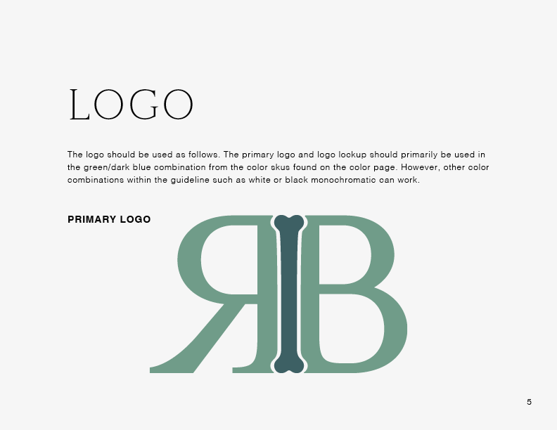
While brainstorming and illustrating different iterations, I played with a lot of R and B variations. I felt inclined to incorporate a bone somehow, so I used trial and error to see what worked and what didn’t. I wanted every element to feel calm, approachable, and trustworthy, so as I went through different variations, I kept coming back to those key attributes to see if they matched each respective logo. Additionally, there were a few other iterations including a dog and paw print, but eventually I felt those didn’t hit the mark as well as the R and B monogram could.
Rebranded Guidelines
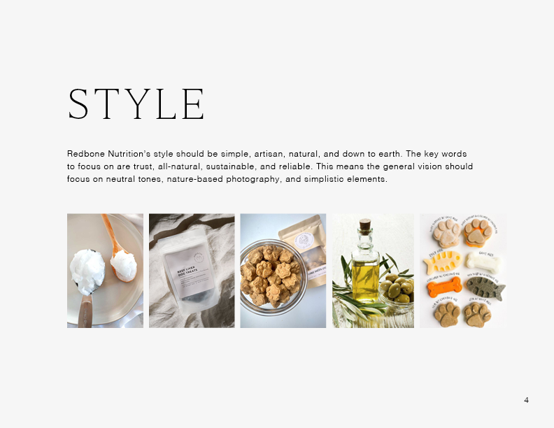
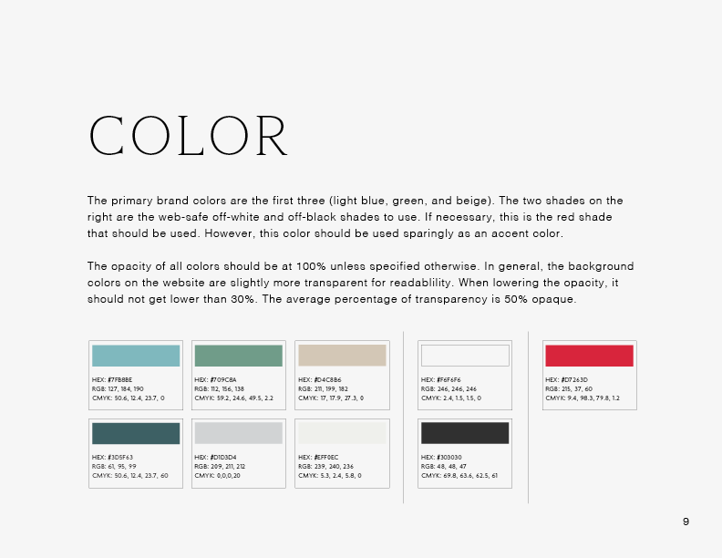
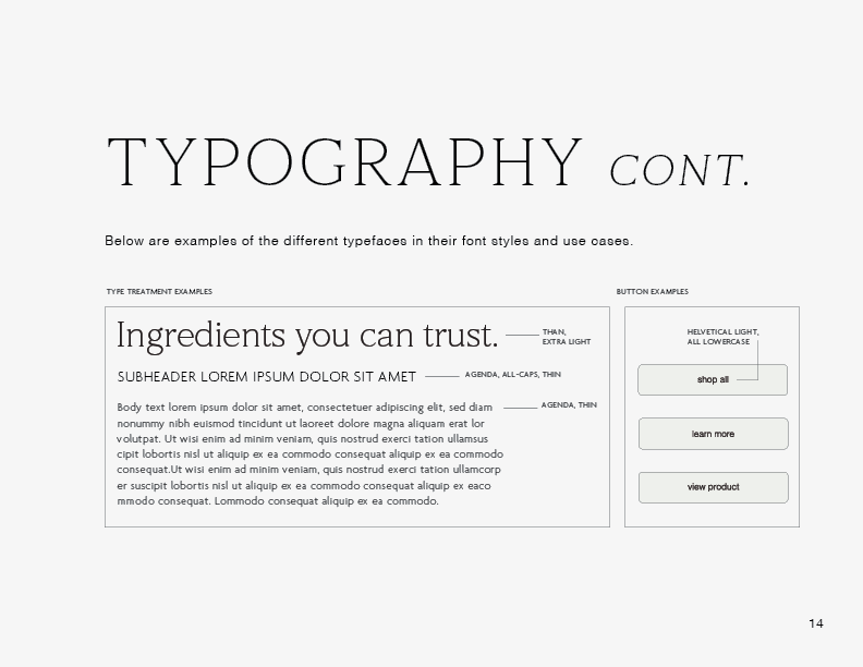
In the new brand, everything is meant to feel approachable, sophisticated, calm, and trustworthy. The typography and color choices create an authentic and relaxed feel that emphasizes the new tone and message of the brand. I prioritized photography and minimal themes. Every element is cohesive and intentional. Learn more about the rebrand and new implemented elements in the brand guideline below.
Product Packaging
The goal with the product packaging redesign was to convey the quality and reliability of these products in a visual way. Prior to the redesign, the product packaging felt like it didn’t represent the product well, nor did it match the tone that the target audience would be looking for. Primarily, the packaging lacked visual hierarchy, and the color scheme and type treatment were too harsh for their desired tone.
My priority was to create visual hierarchy in a simplified way. I wanted to simplify the written elements and ensure they didn’t overpower the space. Every detail was intentional, and if something wasn’t completely necessary for the design or function of the packaging, it was not included.
There are three categories of Redbone’s products: relax, play, and longevity— each with three flavors. There are three categories of products: oils, multivitamin chews, and topicals. With such a large selection of products, it was important they all felt cohesive and connected.
Old Website Examples
Below are a few examples of the original website, prior to the redesign, to give context to why the original elements weren’t working efficiently to convey the brand’s intended tone.
Website Wireframes
For the new website, the main priority was creating a user interface that was easily navigable, digestible, and visually cohesive. The problem with the previous website was unclear navigation and lack of follow through from customers. The traffic to the website was high, but as soon as the user would click on the site, they would leave without purchasing anything. The original website had a lot of distracting elements, so I needed to streamline the focus and make the user experience as intuitive as possible.
Below are examples of the wireframes for both desktop and mobile. I focused on the aesthetic lifestyle photography and simple UI elements to make the navigation process as seamless as possible. The importance of the new branding is that every element, from spacing to type treatment, is intentional and consistent.
You can view the wireframes in more detail via the link below, and learn more about the UX/UI elements, type treatments, and buttons in the brand guideline.


