

SOCIAL MEDIA, PUBLICATION DESIGN
Menus & Venues Social Media
This project explores how a cohesive social media system can celebrate the individuality of multiple brands while reinforcing their connection under a single parent company. Designed for Menus & Venues, the project includes an Instagram profile featuring six carousel posts, along with select layouts adapted into editorial magazine spreads to demonstrate how the visual system could translate across both digital and print.
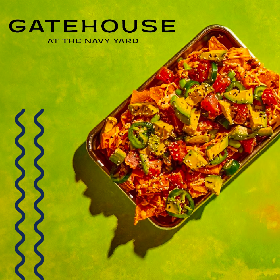
Menus & Venues is built around storytelling and the unique character of each of its four hospitality brands—Gatehouse, Pizzeria Vetri, Terrain Cafe, and Terrain Events. The challenge was to create a flexible content system that allowed each brand to maintain its own voice while connecting to the larger Menus & Venues family. A consistent layout structure paired with brand-specific imagery and messaging creates that balance between individuality and cohesion. Disclaimer: This is a conceptual project and is not affiliated with Menus & Venues or URBN.


Roles Graphic Designer Programs Illustrator, Photoshop, InDesign Timeline 2 weeks
Content Strategy
Strong visual design extends beyond typography, photography, and layout—it creates meaning through storytelling. Each carousel was designed to tell a story, giving users context for the people, places, and experiences behind the brand rather than simply promoting a product or location. The final slides invite users to continue exploring, encouraging deeper engagement. Throughout the series, I prioritized storytelling, strong photography, and brand voice to convey the unique character of each brand.


Magazine Spreads
To further explore the flexibility of the visual system, I extended the project beyond social media by adapting select carousel posts into editorial magazine spreads. The goal was to demonstrate how the same content, typography, and visual language could translate seamlessly across both digital and print while maintaining a cohesive brand experience.
Menus & Venues' photography plays a central role in the identity of each brand, so the larger editorial format created an opportunity to showcase that imagery in a more immersive way. Projects like this are always a rewarding creative exercise, allowing me to explore how a single design system can adapt across multiple formats without losing its identity.


