

BRAND DEVELOPMENT & MARKETING ROLLOUT
Ex Sunscreen
This is a full brand conceptualization and marketing rollout for a new sunscreen product called Ex. The scope of this project includes the brand ecosystem, product and package design, and ads and content for both social media and print.
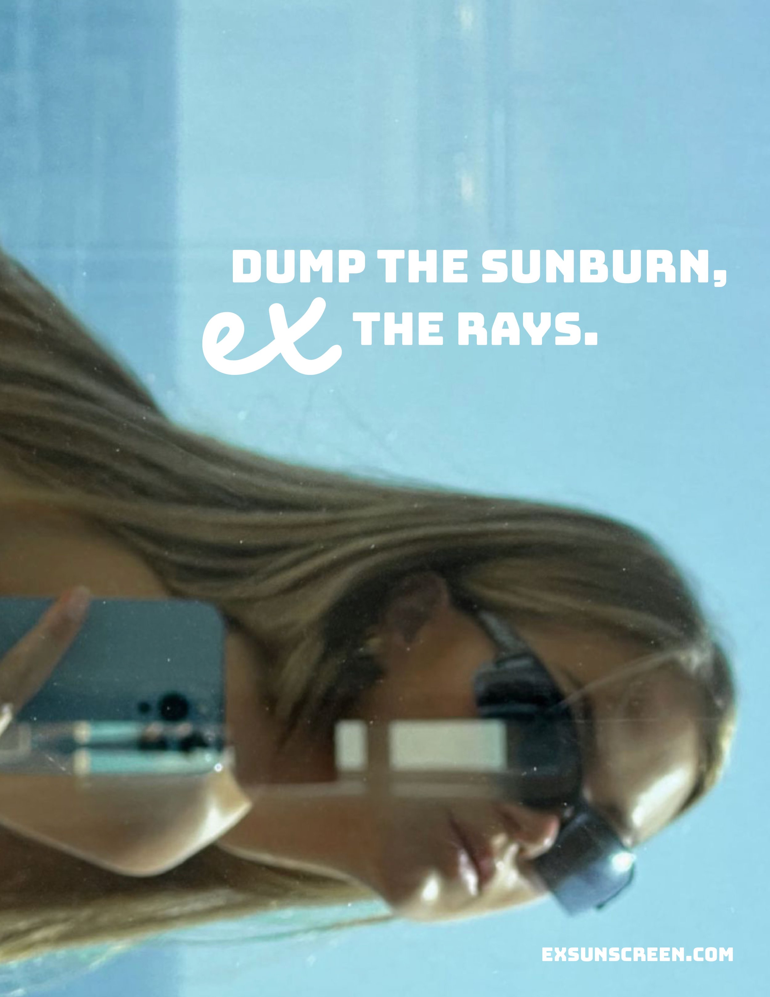
The concept of Ex is a play on the idea of an ex-person being a metaphor for the sun. Leaning into the idea of blocking out the sun’s UV rays with sunscreen, it coincides with how you could block a human ‘ex’ in real life. The product’s voice and tone are very playful and gen-z oriented with language that continues to play into the ex metaphor, such as the primary slogan, “dump the sunburn, ex the rays”. This project won an American Graphic Design Award from the 60th annual GDUSA showcase.

Roles Creative Director, Graphic Designer, Product Developer Programs Illustrator, Photoshop, Indesign Timeline 4 months
Trust the Process
My goal was to create a high-quality, aesthetic product with minimalistic branding, a focus on aesthetic photography, and clever copy that would catch the attention of a gen-z target audience. The visuals that should be evoked when the target audience interacts and thinks of Ex are neutrals, sun, beach life, summer etc.
Initially, I thought it could be a bright, bubbly, and colorful brand due to the connotations sunscreen has to the beach and summer. However, eventually I found myself straying away from the bright colors and playful typography. Through trial and error, I found a way to achieve a beach aesthetic without having to take the bright and bold route.
The first draft was a playful iteration called x-ray, but I realized the connection to the medical procedure of an x-ray was too strong. I liked the bold colors but felt they didn’t correlate with the minimal and clean vision I had. The second iteration was called oasis, which emphasized fun, bright colors and a strong surfing tone. However this was extremely bright and didn’t feel like the right identity for the minimalistic vision I was going for.


Product & Package Design
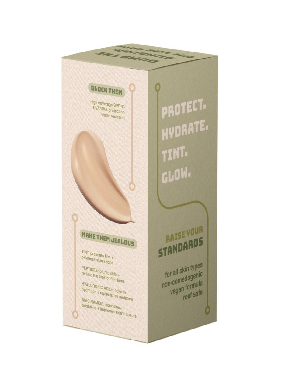
Here is the final product packaging, and box packaging for Ex. The beach aesthetic is brought to life through the neutral color scheme, playful yet neutral typography, and overall simplicity. I played with texture on the packaging by adding a slight texture to the box, as well as a 3D imprint of the sunscreen swatch. As for the product itself, it has a simple and straightforward design that allows the text to be consumable while not overpowering the design.
The text follows the thread of the ex metaphor with clever plays on words. To describe the product, there are four main callouts. The first one is “block them”, referencing the SPF 40 blocking the sun, while also playing into blocking an ex-person via text or social media. Secondly, “make them jealous”, references the great features of the product itself including tint, peptides, hyaluronic acid, and niacinamide, while also playing into the theme of making an ex jealous after a breakup. The third callout is “raise your standards” that references the high standards this product has with features such as non-comedogenic, vegan, and reef safe formula, while also playing into raising your standards in the people you choose to date. Lastly, “say bye to toxic” refers to the clean ingredient list while also referring to saying goodbye to a toxic person. The playful, gen-z language connects to the target audience and creates another facet to the product ensuring its more than just another sunscreen product.


Print Advertisements
The print ads, as seen in the subway, magazine, and bus shelter, follow the same thread of minimalism. I focused on aesthetic photography, simple and clever slogans, and simple product callouts. The photography does a lot of heavy lifting as far as conveying the brand tone, message, and aesthetic.


Digital Content
Continuing on with the digital content/instagram stories, they keep it on brand with the emphasis on minimalism and photography. The key element is the photography. This series is set up as a product rollout with an introduction followed by product callouts and a call to action.


